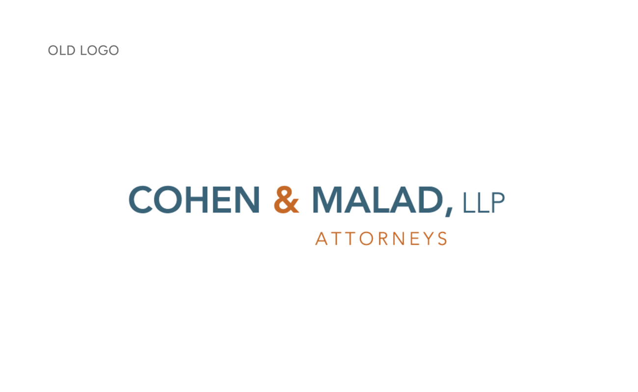
When CohenMalad approached Jackson Sky, they were working with a logo that wasn’t really a logo at all – it was just their name written in a common font. In the past, the firm had struggled with the logo design process, falling into what we often call “analysis paralysis” while searching for the perfect visuals to represent their identity. They wanted something timeless but not stuffy. Modern but not trendy. Unique but not strange.
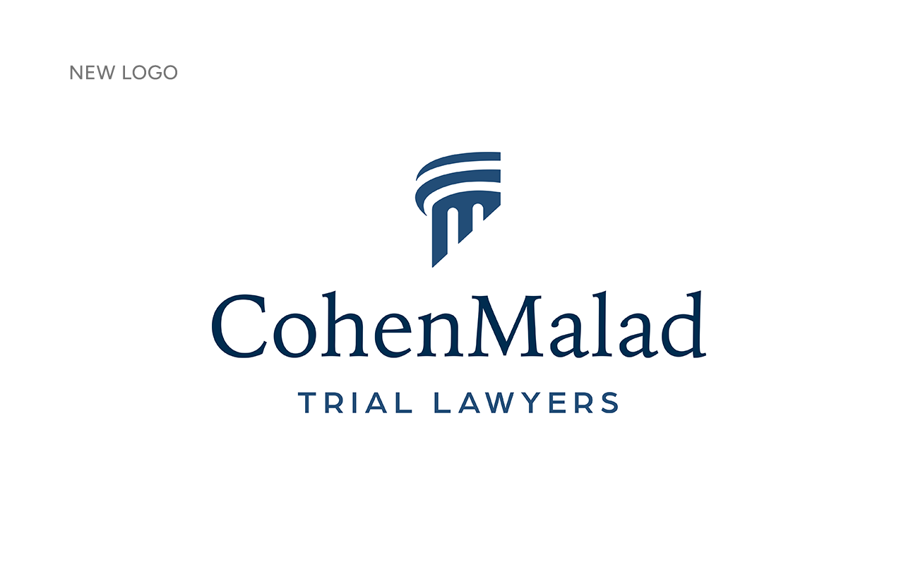
We understand the challenges (and the pressure!) that come with making such a big decision. A logo needs to stand the test of both time and trends. Working closely with the communications team and firm partners, we developed a mark that resonated with everyone. The column symbolizes their prestige and history while its modern design keeps it from feeling heavy or overly formal. The balance of curves and straight lines subtly nods to the “C” and “M” in their name.
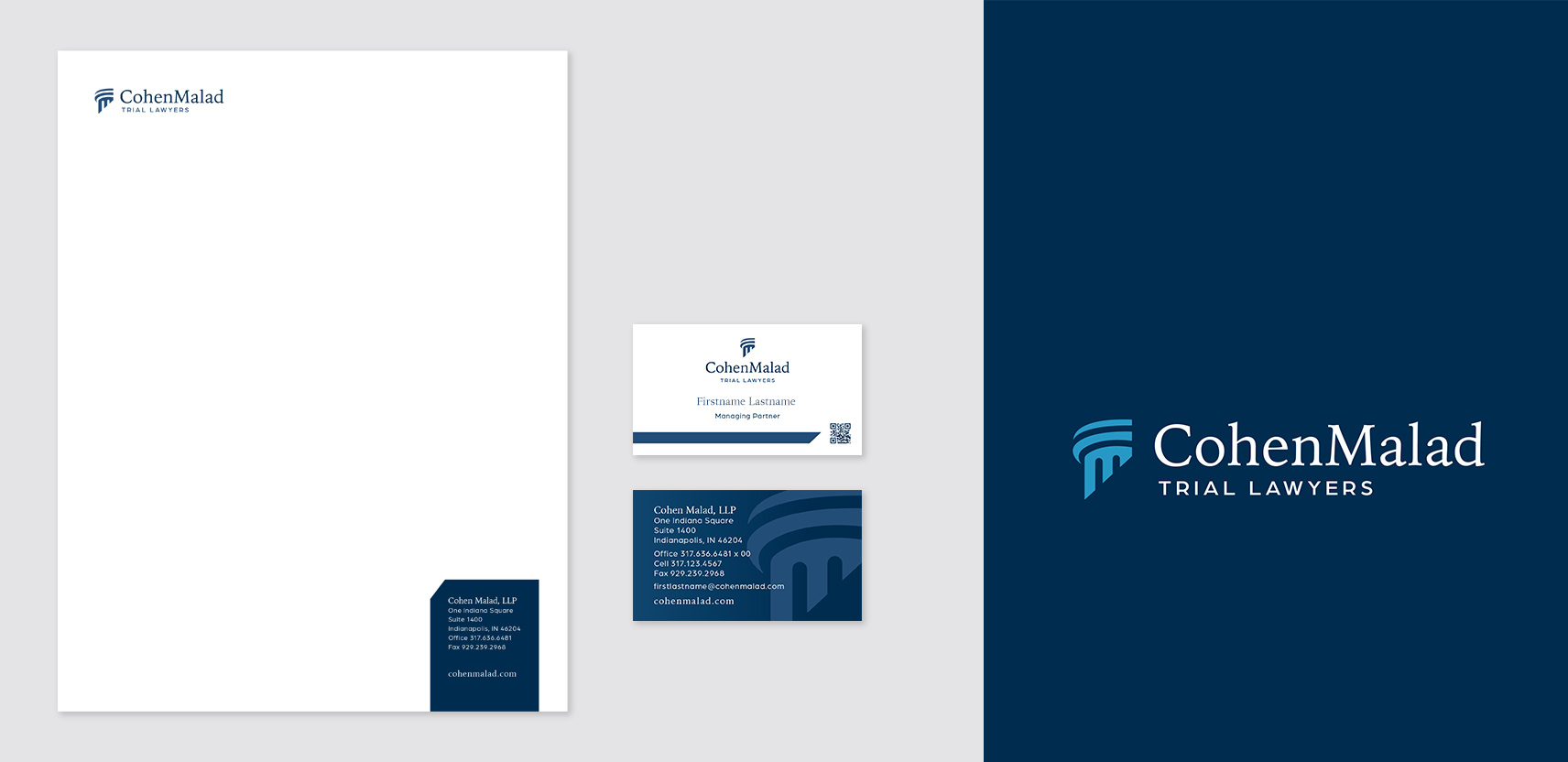
To complete the brand update, we designed letterhead and business cards featuring the new visual identity. We also created an in-depth style guide ensuring their team can maintain brand consistency across every medium—whether it’s social media graphics, promotional swag, print materials or beyond. With this guide, the brand’s look and feel will remain cohesive, confident and unmistakably CohenMalad.