The Project
Our relationship with Central Indiana Land Trust began as many of our client partnerships do—with a simple request that evolved into a long-term collaboration on projects both large and small. The Land Trust’s brand was widely recognized across the state, appearing digitally and on signage at public preserves. However, the font and layout were due for a subtle refresh. The vertical orientation was sometimes difficult to work with, and the serif font no longer resonated with the Land Trust’s team.
Our Approach
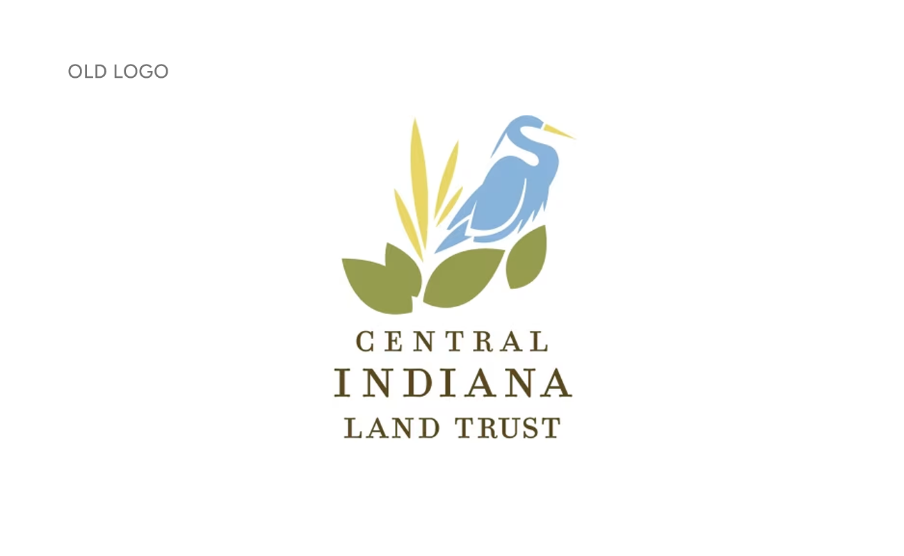
We agreed that the iconic mark should remain untouched. Instead, we focused on updating the typography—pairing the mark with a new type treatment to modernize the logo without making drastic changes.
Solution & Results
The refreshed logo is clean and modern, with multiple layout options provided to accommodate a wide range of applications and spaces of any size.
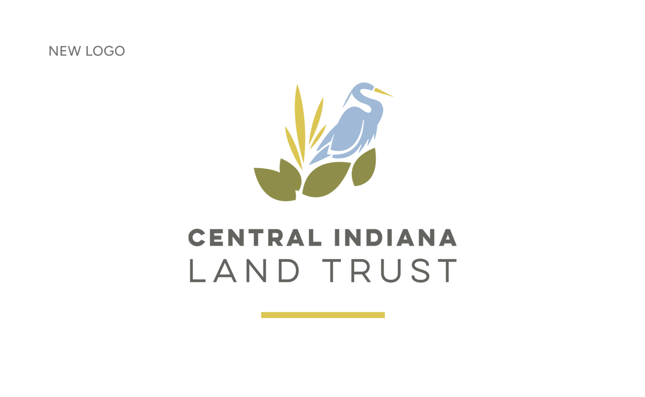
Logo Refresh
By retaining the recognizable mark and updating only the typography and layout, the refreshed logo preserves the legacy of the original brand while making it more versatile and user-friendly. This evolution honors the organization’s history while ensuring it remains relevant across both print and digital platforms.
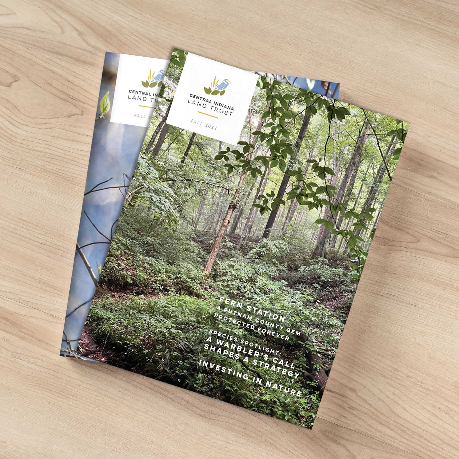
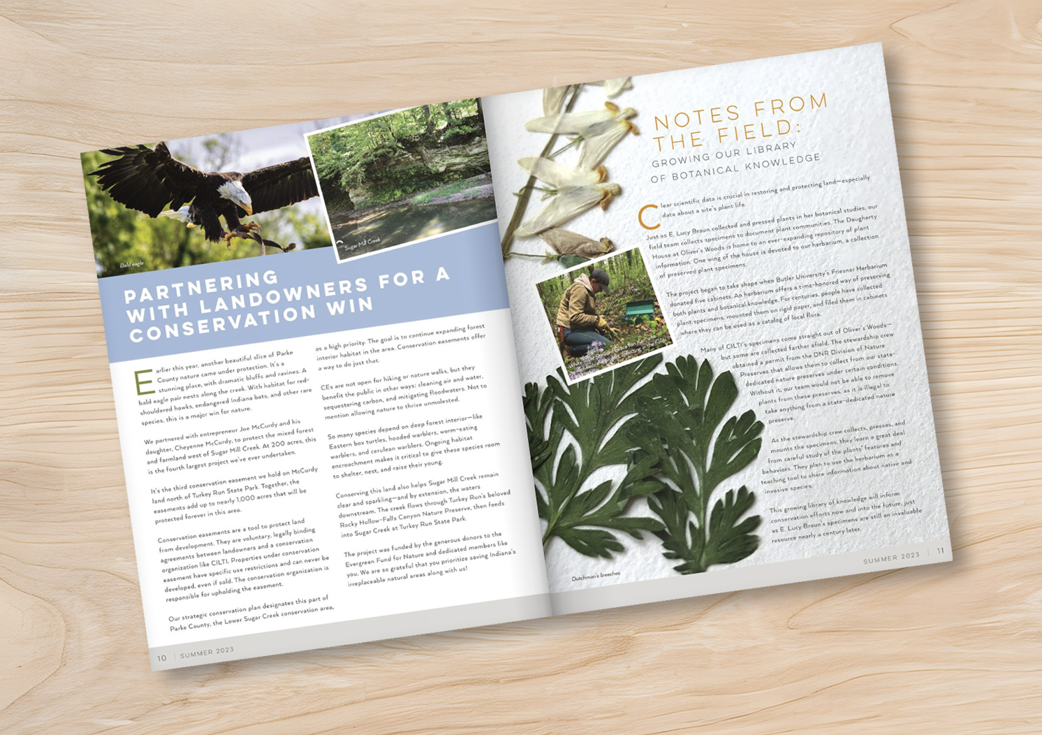
Newsletters & Milestones
After the logo refresh, we partnered with Central Indiana Land Trust on a complete overhaul of their newsletter. Large imagery, custom illustrations, and clean, easy-to-read layouts transformed the publication into a more engaging and accessible piece. We continue to design four newsletters each year, which are printed locally and also made available online through their website.
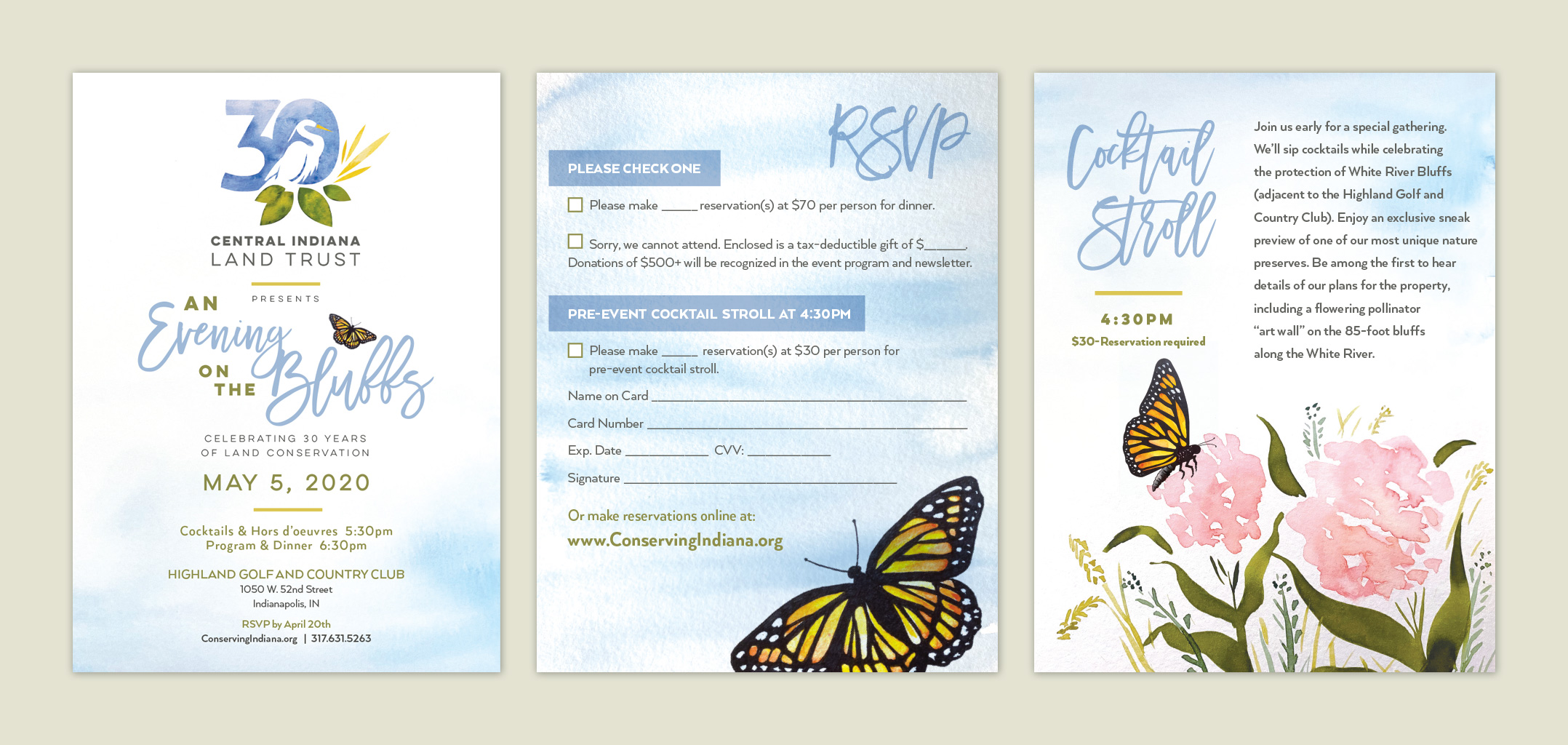
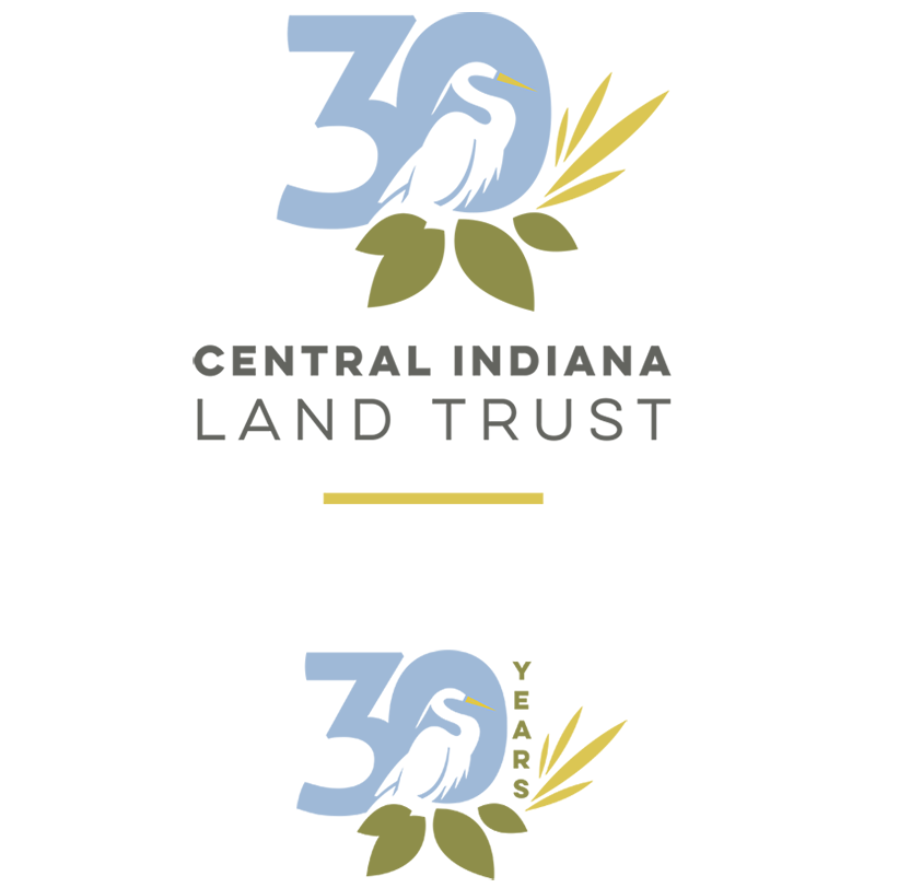
In 2020, Central Indiana Land Trust celebrated its 30th anniversary. To mark this milestone, they commissioned a special anniversary logo to be used across all platforms—from their website to printed materials.
This commemorative logo also inspired the branding for their annual event, for which we designed all the print pieces. Stepping away from digital tools, we used actual watercolor paints to create visuals that highlight the beauty of Indiana’s native flora and fauna.
Website Design & Consultation
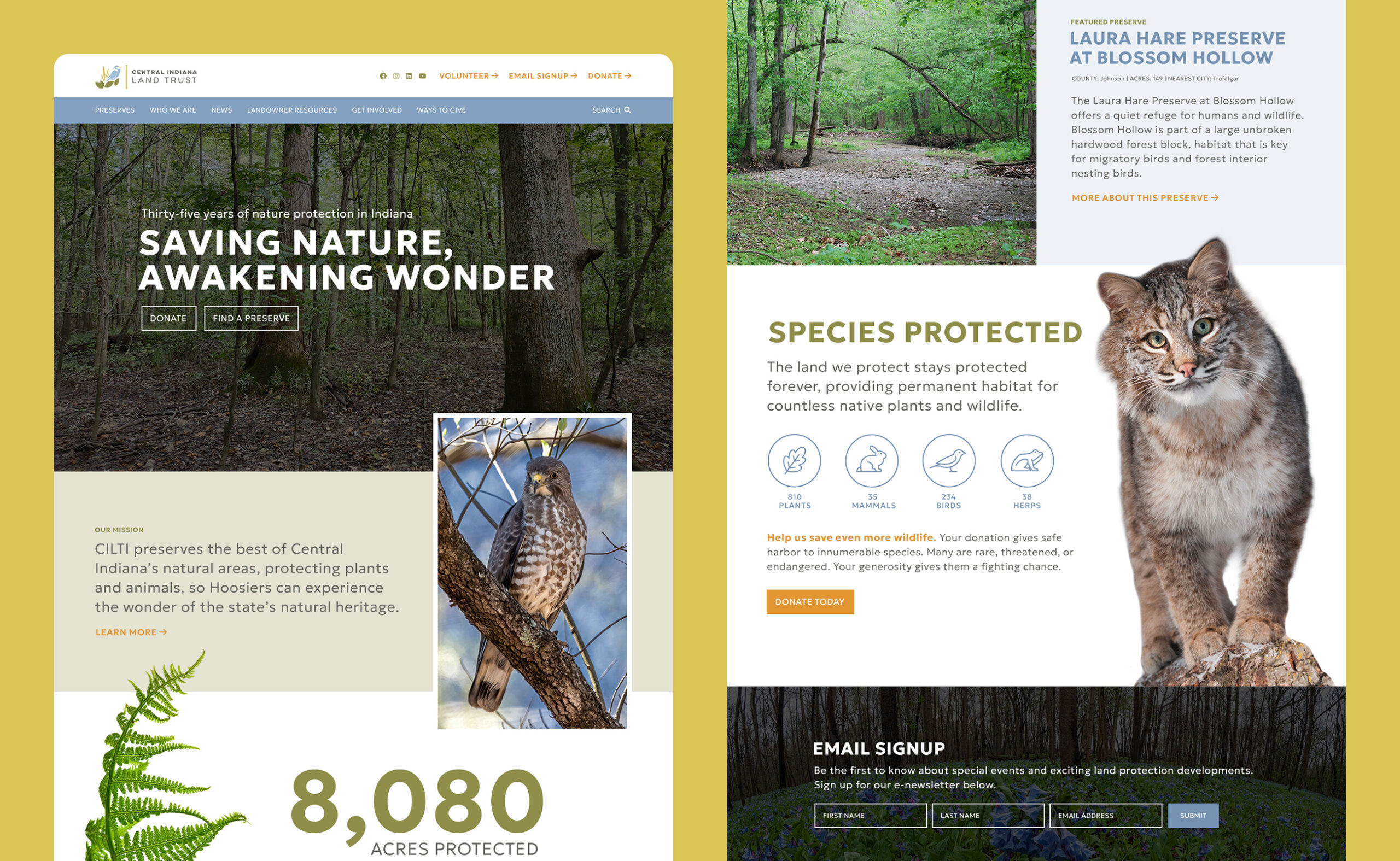
When it came time to redesign the website, we collaborated with their local developer and were brought in to provide creative direction and design consultation. The new site features large, vibrant imagery and detailed pages for each of their preserves. These pages include access information, weather conditions, and descriptions of unique natural features. Jackson Sky also custom-designed the icons used throughout the preserve pages.
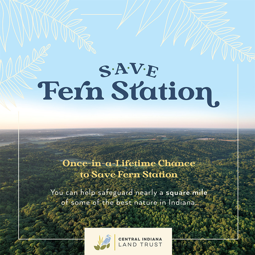
Save Fern Station
Special campaigns such as Save Fern Station give us the opportunity to extend the brand even further by creating custom logos, illustrations, and print materials that support conservation efforts and the protection of natural places here in Central Indiana.