The Project
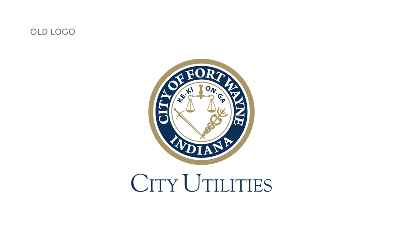
Before our involvement, Fort Wayne City Utilities did not have a dedicated logo of their own. Instead, they relied on the Fort Wayne city seal, with “City Utilities” placed inconsistently beside or beneath it. The goal for the new logo was to create a clean, modern design that conveyed professionalism and polish, while also serving as a foundation for three key programs under the City Utilities umbrella: Drinking Water, Sewer, and Stormwater.
Our Approach
Jackson Sky partnered with Empower Results to develop a new visual identity for Fort Wayne City Utilities. In addition to the logo design, we created supporting materials and custom illustrations for a special initiative, Tunnel Works. Our approach ensured the new identity would be flexible enough to represent the overall organization and individual programs.
Solution & Results
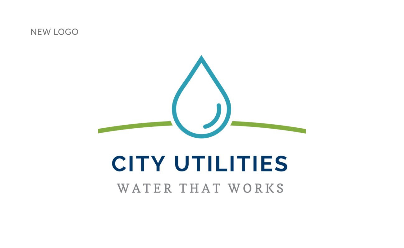
The final logo is simple, professional, and highly adaptable. A comprehensive styleguide now serves as a resource for City Utilities staff, enabling them to create consistent and on-brand materials both now and in the future.
Designed for Versatility
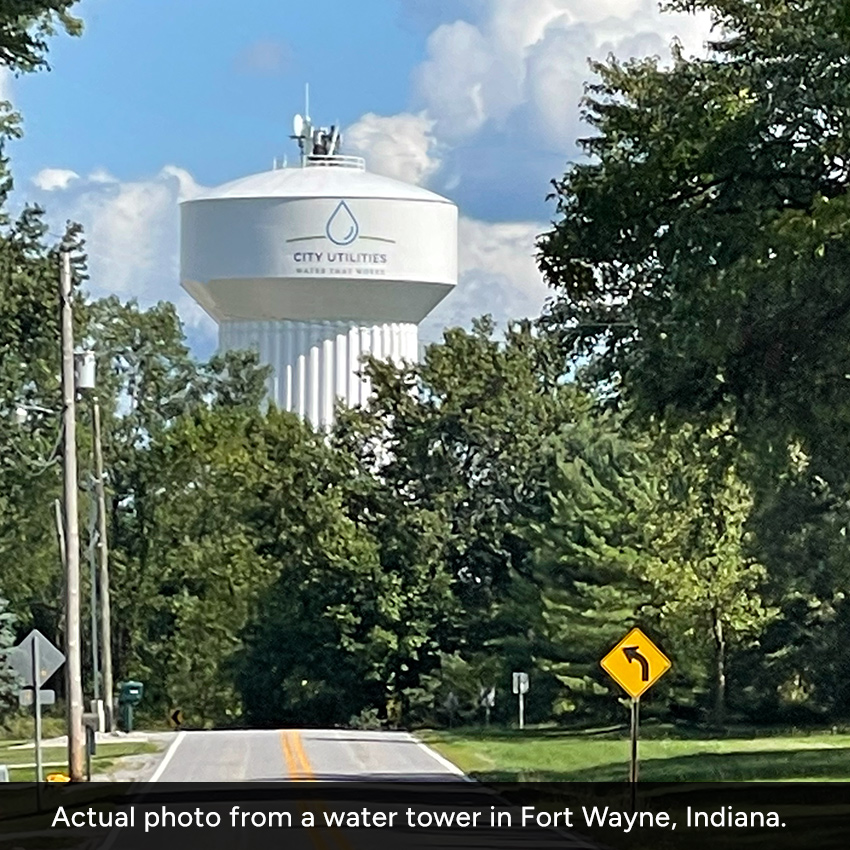
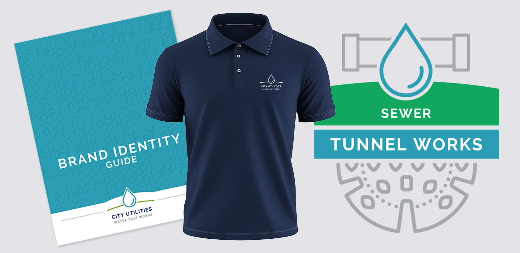
The City Utilities logo is a constant presence across a wide range of applications—from invoices and marketing materials to apparel and even water towers. Because it represents the organization in so many different contexts, the logo needed to embody the essential qualities of a successful mark: it must be scalable for use at any size, work effectively in a single color, and remain instantly recognizable. These traits ensure that the brand maintains its integrity and impact, whether viewed on a small printed document or a massive public structure.

Program Logos & Color Strategy
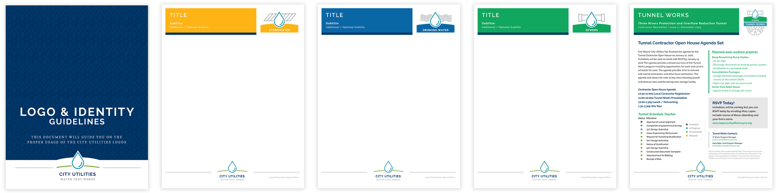
Alongside the main identity, we developed program-specific logos, each with its own distinct visual attributes to reflect the unique focus of Drinking Water, Sewer, and Stormwater. While each logo has its own character, all are designed to align seamlessly as part of a cohesive brand family. To further strengthen this system, we created a comprehensive color palette that assigns unique colors to the overall brand, each program, and any special projects or action items. This structured approach not only supports brand recognition but also makes it easy to distinguish between programs at a glance, whether in print, online, or out in the community.
Tunnel Works: From Bedrock to Brand
A major component of this partnership was developing marketing materials for the Tunnel Works campaign.
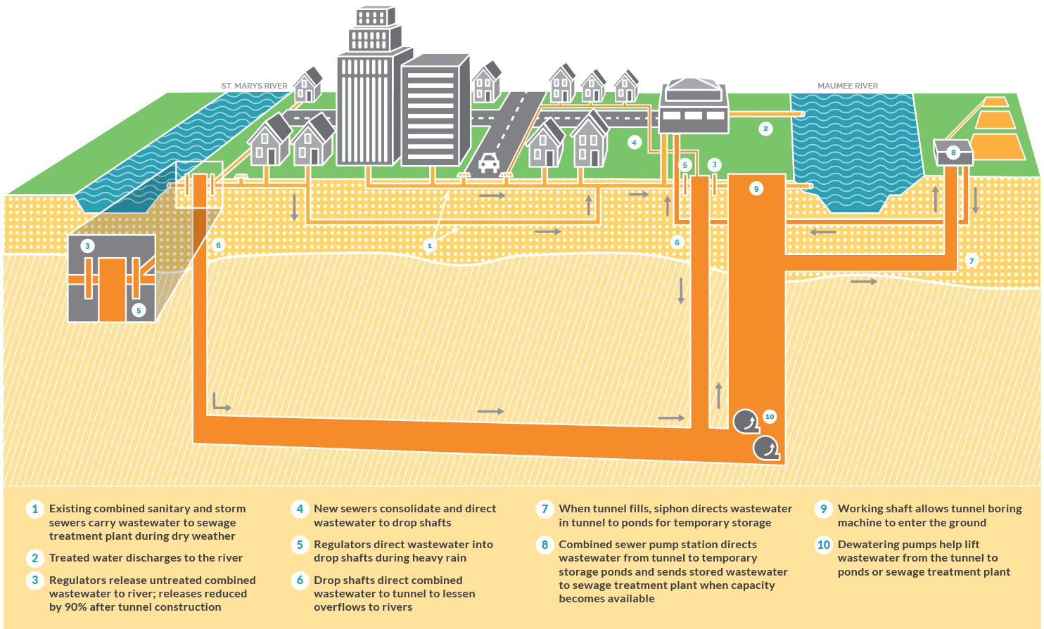
The Tunnel Works project involves constructing a deep rock tunnel beneath the city of Fort Wayne. This tunnel will collect and transport sewage from the sewer system to the treatment plant—preventing overflow into the rivers during heavy rain.
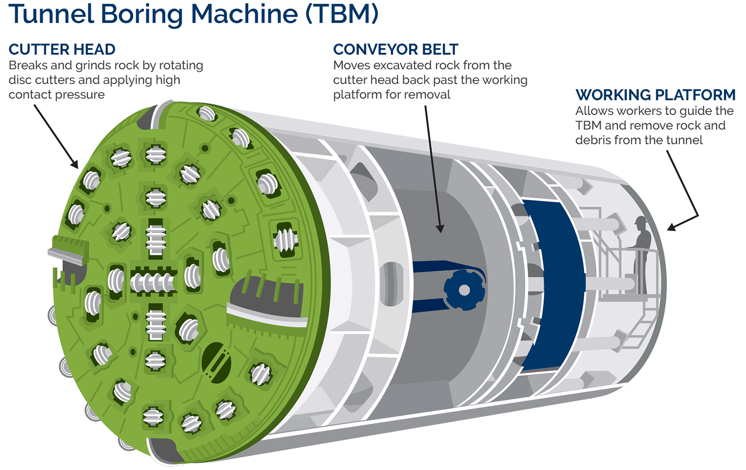
To support the City’s commitment to public outreach, we created visuals that would help residents understand the project’s purpose and scope. These included a custom cross-section of the city to show exactly where the tunnel would be located, a detailed illustration of the tunnel boring machine, and a project timeline designed to match the overall campaign materials.
All of these elements were designed to be visually cohesive, accessible, and easy for the public to interpret. Combined with additional text and photography, they formed a large display used at public meetings, community events, and online to inform and engage the community.